Maps: The Big Picture
Originally published in the Santa Cruz Sentinel, March 7, 2015
Maps help fulfill “the need to visualize our little
lives in the context of a grander scale.”
-Ken Jennings
Before I take a trip to an unfamiliar place, I go to
AAA to get a free map of the area. Yes, I have a cell phone, but a fold-out map
gives me the big picture and all the details at the same time. My cell phone, with its tiny screen, can’t do
that. After I’ve unpacked my bags, it’s
time to unfold the map, spread it out on the bed, and plan my next move. Once I
know my destination, the cell phone will help me find my way.
.jpg) |
Attributed to prolific Dutch mapmaker Joan
Vinkeboons, 1650. Even though Cabrillo had proven California to be part of
North America in his 1542 expedition, some European cartographers continued to
depict California as an island well into the 18th
century—cultivating its mythic mystique.
|
Maps: Depth and comprehensiveness
The big picture is important, and so, maps still serve
a useful purpose—they show you things you don’t know, in relation to things you
do know. If you decide you need to know where Ukraine is for example, a map
will show you that it’s two countries away from Germany, with Poland in
between. It will also show you that it shares the Black Sea coastline with
Russia and Turkey and three other countries. And yes, I had to look at a map to
tell you that.
Maps help us understand what’s going on in the world. “We
live in an increasingly inter-linked world where developments an ocean away
affect our daily lives in countless ways,” says Ken Jennings of “Jeopardy!”
fame. If we know where Ukraine, or North Korea, or Nigeria is on the world map,
we can “synthesize and remember the events that we hear about taking place
there.” Otherwise, they just become
names that wash over us.
Jennings wrote the book “Maphead” in 2011 about his
life-long fascination with maps. “My childhood love of maps…was something much
more than casual weirdness,” he writes. “I could literally look at maps for
hours. Each page of an atlas was an almost inexhaustible trove of names and
shapes and places, and I relished that sense of depth, of comprehensiveness.”
In “Maphead” Jennings sees geographic illiteracy as a serious societal
problem in the U.S., and gives lots of examples including a National Geographic
poll showing that one in ten American college students can’t find California or
Texas on a map. Geographers trace our decline in geographic knowledge to the
widespread adoption of “social studies” in grade schools over clear-cut history
and geography classes in the 1960s and 1970s. “The United States is now the
only country in the developed world where a student can go from preschool to
grad school without ever cracking a geography text,” says Jennings.
 |
Author Rebecca Solnit’s “Infinite City-A
San Francisco Atlas”
features various Bay Area maps, including this one called
“Poison/Palate” which shows the proximity of gourmet treasures
to toxic
waste in the Bay Area, and features mutant
mermaids
and a fruit tree “to both whet and ruin your appetite.”
|
Geography of course, isn’t just about reading maps or
understanding the Earth’s physical features. It’s about how humans relate to
the planet. “Geography explains the
map: why this city is on this river, why this canyon is deeper than that one,
why the language spoken here is related to the one spoken there—even perhaps,
why this nation is rich and that one is poor,” says Jennings.
A great example of maps that help us make sense of our
complex relationship to the planet is “Infinite City: A San Francisco Atlas” by
Rebecca Solnit. Her book features maps (created by various artists), that make
surprising and intriguing connections. “Poison/Palate” shows the proximity of gourmet
treasures to toxic waste in the Bay Area. “Dharma Wheels and Fish Ladders”
plots the little-noticed salmon migrations in the Bay Area, beside the practice
of Zen Buddhism. And “The Names before the Names” charts the 140 or so
indigenous tribes that lived in the Bay Area prior to 1769—an astounding
density of communities which have since completely vanished.
Mapmaking: A
reflection of the maker
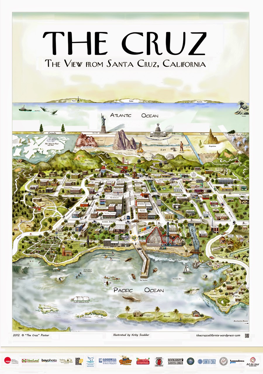 |
| Scudder takes many months
to draw each of his city maps. The series now includes Santa Cruz, Monterey, Palo Alto and Boston. The Santa Cruz poster was so popular, he also made a 30-foot mural version for the corner of Bay and Mission Streets. |
All mapmakers choose what to include as well as what
to leave out—and accordingly, a map is a reflection of its maker and how it
will be used. Santa Cruz artist Kirby Scudder created a poster of Santa Cruz in
2012 that included only the features he found most emblematic of the city. To
create large city maps, he uses Google Earth for research and Photoshop with a
Wacom tablet to painstakingly draw people, vehicles, buildings, shadows, land
and water features from an angled aerial perspective. He takes great liberties
with spatial accuracy—bending and foreshortening land masses, selectively showing
only the resonant landmarks, streets and buildings he believes are the essence
of “The Cruz.”
Historically, mapmakers have always had a point of
view, and many wanted to tell stories of adventure and discovery. They rarely
had the firsthand experience they needed to be certain of all the details on
their maps, so they listened to surveyors and explorers, read books and studied
existing maps, and made educated guesses. Oftentimes, they made mistakes. One
of my favorite books of historical maps is Vincent Virga’s “California, Mapping
the Golden State through History” which begins with the famous 1650 Map of
California shown as an island. By the mid 1700s, California was finally attached
to the rest of the continent on maps, but with very few details, remaining on
the fringes of the world as the Europeans knew it.
 Mapmakers are also influenced by commercial concerns:
they want to sell maps. A U.S. map produced in 1849 shows most of North
American in great detail with two insets on either side: one of South America,
and the other of the California gold country, to make it more appealing to map-buying
gold-seekers.
Mapmakers are also influenced by commercial concerns:
they want to sell maps. A U.S. map produced in 1849 shows most of North
American in great detail with two insets on either side: one of South America,
and the other of the California gold country, to make it more appealing to map-buying
gold-seekers.
Some of the best old maps of California are
romanticized versions of the frontier. They depict the carefully planned streets
and grandest structures of farm cities like Fresno and Bakersfield at the turn
of the 20th century from that same vanishing point perspective in
the sky as in Kirby Scudder’s Santa Cruz. But each map is bordered with a
series of hand-tinted photos or drawings of various businesses, impressive homes
and civic structures. These flat, hot central valley towns were trying to
attract new residents by making their city look substantial, thriving and full
of opportunity.
 |
“Map of Fresno, California, 1901” from the
Library of Congress
website, LOC.gov
|
 |
“Map of Bakersfield, California, 1901”
from the Library of Congress
website, LOC.gov
|
On the Map
However accurate a map is intended to be, it can only
offer a snapshot of what things were like at a certain point in time, and is
already out-of-date when published. Fortunately, most maps are not intended to
accurately describe spatial relationships. They are intended to make a point.
Whether you use GPS, Google Earth or paper, maps are essentially a collection
of cartographic symbols—straight and wavy lines that help us make sense of the
world and our place in it.